




When a sensor goes rogue: how we spot weird data on the map
Green marker, scary spike, frozen humidity at 119% — the map believes whatever the sensor sends. We built a watchdog that reads the whole chart for patterns that don't add up, and flags them with a gentle "this might be wrong." Here's how it works, with a few real sensors that tried to fool us.
Not every marker on sensors.social tells the truth.
Most of the time, citizen sensors do exactly what you’d expect: they breathe with the weather, react to traffic, spike when someone burns leaves two blocks away. But sensors are physical things. They get wet, dusty, knocked loose, or start drifting. And when that happens, the map can still show a number — a very confident-looking number — that doesn’t match reality at all.
The chart warning isn’t meant to scold anyone. It’s more like a friend tapping your shoulder: “Hey, maybe double-check this one.”
What you see on the map vs. what’s really going on
When you open the map in Daily Recap mode, each sensor shows the highest value it recorded that day for whatever you’re looking at — PM10, temperature, noise, and so on. One number, one color, easy to scan.
But a single daily max can hide a lot. A dust sensor might report “2 µg/m³” all day long — technically a valid number, technically the max — while never reacting to a passing car, construction dust, or breeze. Temperature might wiggle a bit while humidity sits frozen at 119% for twenty-four hours straight.
That’s why the warning looks at the whole story in the chart, not just the daily max on the marker.
How we decide something looks off
Behind the scenes, the map runs a small health check on sensor readings whenever you’re in Daily Recap mode and open a chart — frozen lines, impossible humidity, dust that barely budges. The kinds of things you’d side-eye yourself after staring at the graph for a few minutes.
When we run the checks
The watchdog only wakes up in Daily Recap (not Realtime). When you click a sensor and look at its chart, we take all the readings for the period you’re viewing — a single day, a week, or a month — and analyze them one calendar day at a time.
Each day gets its own pass/fail notes. If you’re looking at a week and any day in that week looks suspicious for PM, climate, or noise, the warning can show up for that tab. The badge names the specific metrics that failed — PM10, humidity, noise average, and so on.
Results are cached in your browser so we don’t re-scan the same history every time you click around. Today’s data gets rechecked as new readings arrive.
What we actually look for
We sort everything into three groups. A sensor can fail one, two, or all three independently.
Air (PM10 & PM2.5)
- Frozen dust readings — the values barely wiggle all day. Real particulate matter changes with traffic, wind, and human activity; a flat line usually means the sensor stopped picking up real changes in the air.
- Stuck near zero — PM10 or PM2.5 reports almost nothing (under 1 µg/m³) for hours on end. That’s often a dead or clogged sensor.
- Wild repeating spikes — the graph bounces hard between low and high, over and over, and stays in elevated PM for much of the day. A few spikes from a bonfire or someone smoking nearby are normal; an all-day rollercoaster at urban pollution levels is not.
- PM2.5 higher than PM10 — fine particles are part of coarse dust, so PM2.5 shouldn’t beat PM10 by a wide margin for long stretches.
- Weird PM2.5 / PM10 ratio — the two measurements tell contradictory stories, which doesn’t match how aerosols usually behave.
Climate (temperature & humidity)
- Humidity above 100% — or stuck at the same impossible value all day. A reading of 119% is a sensor fault, full stop.
- Humidity at 100% for 8+ hours straight — even at exactly 100%, that rarely lasts all day outdoors without rain or fog right on the sensor.
- Temperature and humidity frozen together — both lines perfectly flat while the weather around them is clearly changing.
- Humidity jumping wildly — big instant swings (60 → 20 → 65 → 25) that don’t match real weather shifts.
Noise (average & max)
- Average and max glued together — peak noise is almost always louder than the average. When both readings report the same number for days, the microphone is probably broken.
- A flat roar or flat silence — noise stuck at 80+ dB with no variation, or stuck near zero in a place that clearly has life around it.
What we don’t do
The map doesn’t delete, hide, or rewrite readings. Every value stays on the map and in the history exactly as the sensor sent it. The yellow badge is only a heads-up on the chart — for the tab and dates you’re viewing.
Brand-new sensors get a short warm-up too, so a fresh install isn’t flagged the moment it goes live.
The goal isn’t perfection. It’s to catch the cases where the shape of the data — stuck, impossible, or bouncing — tells you the device needs attention, even when the marker on the map still looks fine.
When the marker isn’t enough
Here are three patterns on the map right now — each with a link below so you can click through yourself. One has humidity doing impossible things on a June afternoon. Another shows dust readings frozen near the floor — in Togliatti and on the Cyprus coast. The third paints the marker red with a pollution spike that falls apart the moment you look at the week-long chart.
Same map, same daily max on the marker — three completely different ways the data stops making sense once you scroll the graph.
Example 1: a summer day that feels like winter
This one lives near Togliatti, Russia. On 23 June 2026 it reported outdoor temperatures mostly between 3 and 12 °C.
In late June, in that part of the Volga region, you’d normally expect something much warmer. The temperature line already raises an eyebrow — but the humidity is the real giveaway: it sat at about 119% the entire day.
Humidity cannot exceed 100% — that is a hard limit in how air holds moisture. A steady reading of 119% is not extreme weather; it points to a sensor problem: moisture inside the housing, a damaged element, or an installation that shifted after repair.
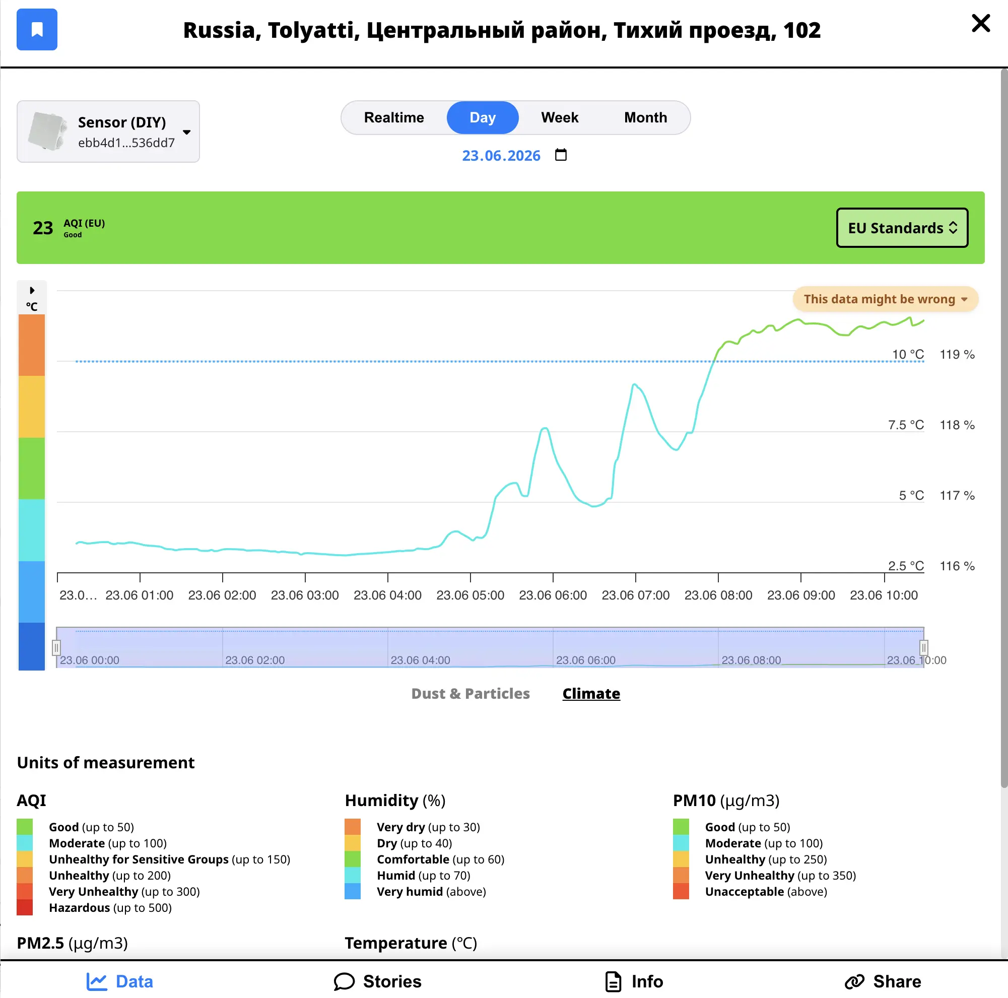
Open the climate tab on the chart and you should see the warning badge flag humidity — maybe temperature too, but humidity is the smoking gun. The marker on the map might look merely odd; the chart tells you it’s broken.
Example 2: the cleanest air on Earth (probably not)
On 23 June its PM10 barely moved all day: mostly between 1 and 2 µg/m³, with PM2.5 even lower.
On a good day in town, PM10 can stay well under 20 µg/m³ for hours — that’s normal. What catches our eye here isn’t a low number on its own; it’s a line that barely moves: ~1 µg/m³, reading after reading, almost identical. Real outdoor air shifts a little with traffic, breeze, and weather even on a calm day. A flat trace this low usually means the sensor stopped picking up real dust, not that you’ve found the cleanest block on Earth.
The chart pattern is a classic stuck dust line: small, polite numbers, almost identical reading after reading. The device is online and sending data just fine. It’s just no longer breathing real air.
We already know why: the intake tube clogged. The sensor sits in a window mount, and any action to pull it out or replace the tube may cause the whole window to crack — so for now, suspicious data beats a broken pane.
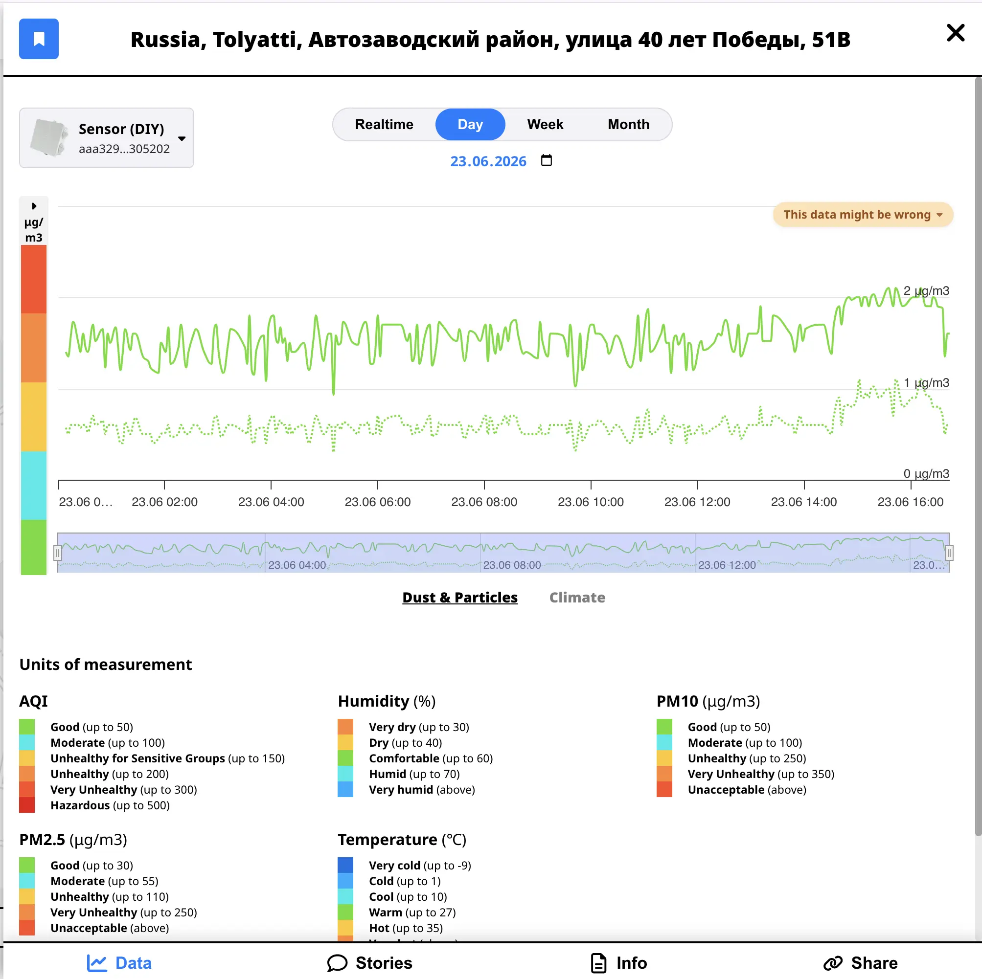
That’s the thing about open sensor maps: the marker doesn’t know your life circumstances. It only knows what reaches the sensor. A blocked tube reads like pristine air. The warning badge is doing its job here — flagging “this probably isn’t real” until someone can fix it.
On the map the marker might even look reassuringly green. Open the chart and the story is different.
Same story, different marker →
A few kilometres away in Togliatti, another sensor hovers around 1–3 µg/m³ PM10 day after day — same flat, barely-moving shape on 20 June and other dates. Different device, different rooftop. You don’t need to know the owner or the backstory to notice that it probably isn’t reading real air anymore.
On 24 June, a sensor near Paphos went a step further: PM10 and PM2.5 sat at 0.0–0.2 µg/m³ for the whole day — 330+ readings, essentially zero. The device is online and sending data just fine. The dust readings aren’t. That’s the stuck near zero pattern in plain sight: not clean air, just no signal.
Example 3: 415 on the map, chaos on the chart
This one is up in Karelia, near Lake Ladoga. On 21 June 2026 the sensor logged dozens of readings — but what a chart they make.
PM10 shot up to 415 µg/m³ that day, with PM2.5 chasing it almost step for step. On the map, that daily max paints the marker an alarming color — as if there’d been a serious pollution event.
Look closer at the chart and the shape doesn’t look like smoke, dust, or traffic. Real pollution events usually build up and fade. This one swings between high and low all day long — readings mostly above 80 µg/m³, not a single brief spike — more like a loose connection than a changing sky.
Pull up the whole week and the story doesn’t get better: humidity frozen at 119% every day the sensor was online (check the climate tab), PM doing rollercoasters from calm to scary (spikes above 400 µg/m³ on 16, 20, and 21 June — the PM tab), and two silent days in the middle where it barely reported anything at all. Switch to week view: if any day in the window looks broken, the warning can still appear. That’s not a one-off bad afternoon — it’s a device that needs help.
And there’s the same humidity tell we saw in Example 1. One broken climate measurement is already suspicious. Pair it with PM values doing gymnastics all week and the picture is pretty clear: check the hardware, don’t write a headline about toxic air.
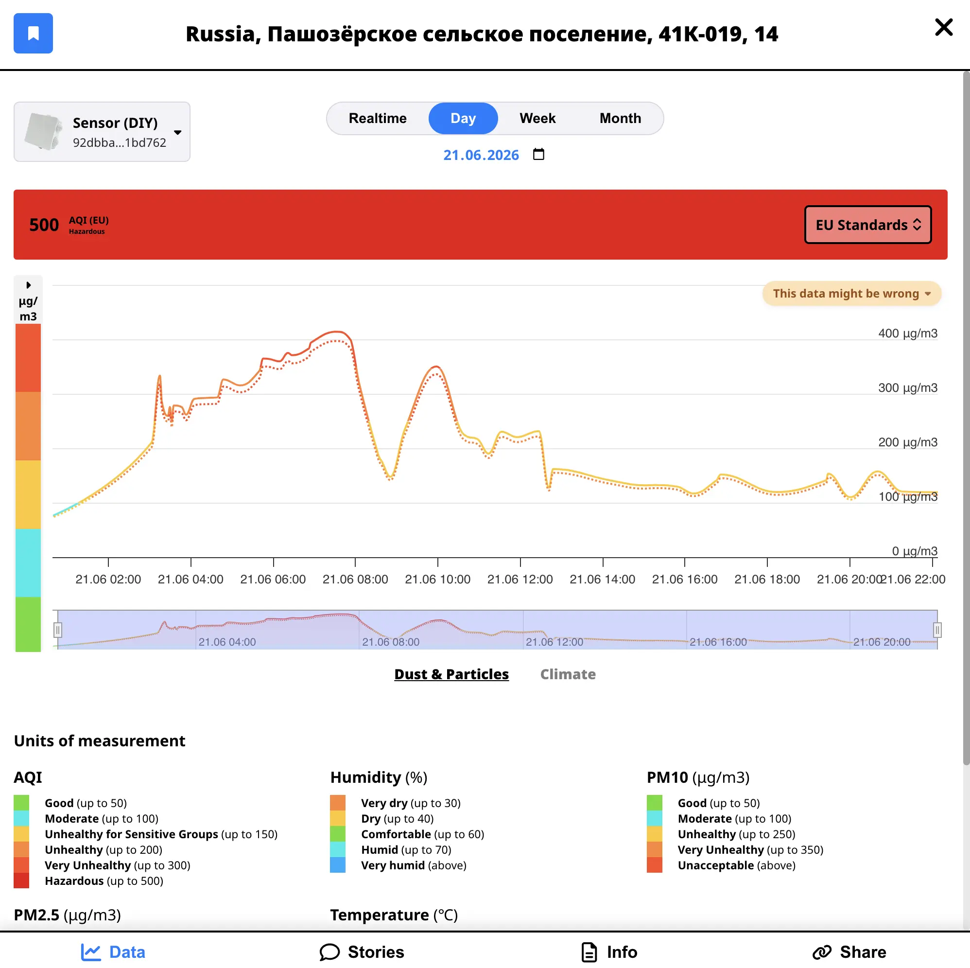
This is why we nag you to open the chart. Sometimes a rogue sensor looks too clean (Example 2). Sometimes it looks too scary (this one). Sometimes humidity is quietly impossible while everything else almost looks fine (Example 1). The badge is there for all of them.
What should you do if you see the badge?
If it’s your sensor:
- Check the basics — is the device sheltered from direct rain? Is the air intake clear? Did anything change after a recent move or repair?
- Look at the chart, not just the marker — a single max value can look fine while the day-long pattern is clearly broken.
- Reach out — if you’re stuck, support can help walk through setup and diagnostics.
If it’s someone else’s sensor — treat it as a reminder that open data is honest data, including the bad days. One rogue sensor doesn’t spoil the network; it shows you why transparency matters.
Why bother showing bad data at all?
We could hide suspicious sensors. Some platforms do. But a missing marker and a wrong marker tell different stories. A missing sensor is silence. A wrong one with a warning says: this device needs attention, and the historical record stays intact for debugging.
The goal of sensors.social isn’t a perfectly smooth map. It’s a trustworthy one — where you can see the environment, track pollution in your area, and still follow the thread back to raw measurements when something interesting (or broken) happens.
Next time a marker looks too good, too bad, or just a little weird — click it. Scroll the chart. If the badge is there, you already know more than the color alone could tell you.